October 14, 2017
Our class schedule for the first semester of TypeMedia
Note: I finished the majority of this post in the second week of class, but things got so busy, so fast, that it’s taken me until now to really finish it and post it. Hopefully the classes and projects described below point out why it’s taken so long. 😄
We’ve finished the first two weeks of class in TypeMedia, and we now have a pretty good view of what this semester will be like – and a very full plate of exciting, challenging projects.
In part because of how much work there already is to do, I won’t be making posts to document most weeks of TypeMedia, but before I’m really in up to my eyeballs, I want to take the chance to record who is teaching, what we will be covering in the first semester, and a few of the lessons we received in the first days of class.
But first, a quick story of personal mishap.
I love ice cream. One of the places I miss most in Brooklyn is Ample Hills, with their incredible, additing, wacky ice cream flavors like Ooey Gooey Butter Cake and the too-short-lived Peanut Butter 4 President (they also have some very fun illustrations in their stores).
You can imagine, then, how proud I was of myself to think of putting vanilla ice cream onto a stroopwafel to make a very Dutch, very delicious ice-cream sandwich.
Unfortunately, I also have two half-fake front teeth, due to tripping and smacking my mouth on concrete when I was about 8-years-old. They rarely chip, but I tend to avoid biting directly into hard foods like apples without first cutting them and then chewing with my back teeth. Still, every once in awhile my front teeth just chip, anyway. As it turns out, a cold stroopwafel was too much for them, so as I was enjoying my invention the night before the first day of class…
I felt the crunch of a front tooth on a bite.
Lesson learned: stroopwafel sandwiches are bad news. A slight upside: I’ve since learned that the mixture tastes better anyway if you break up the stroopwafel and mix it into ice cream – it’s more like an Ample Hills concoction, that way.
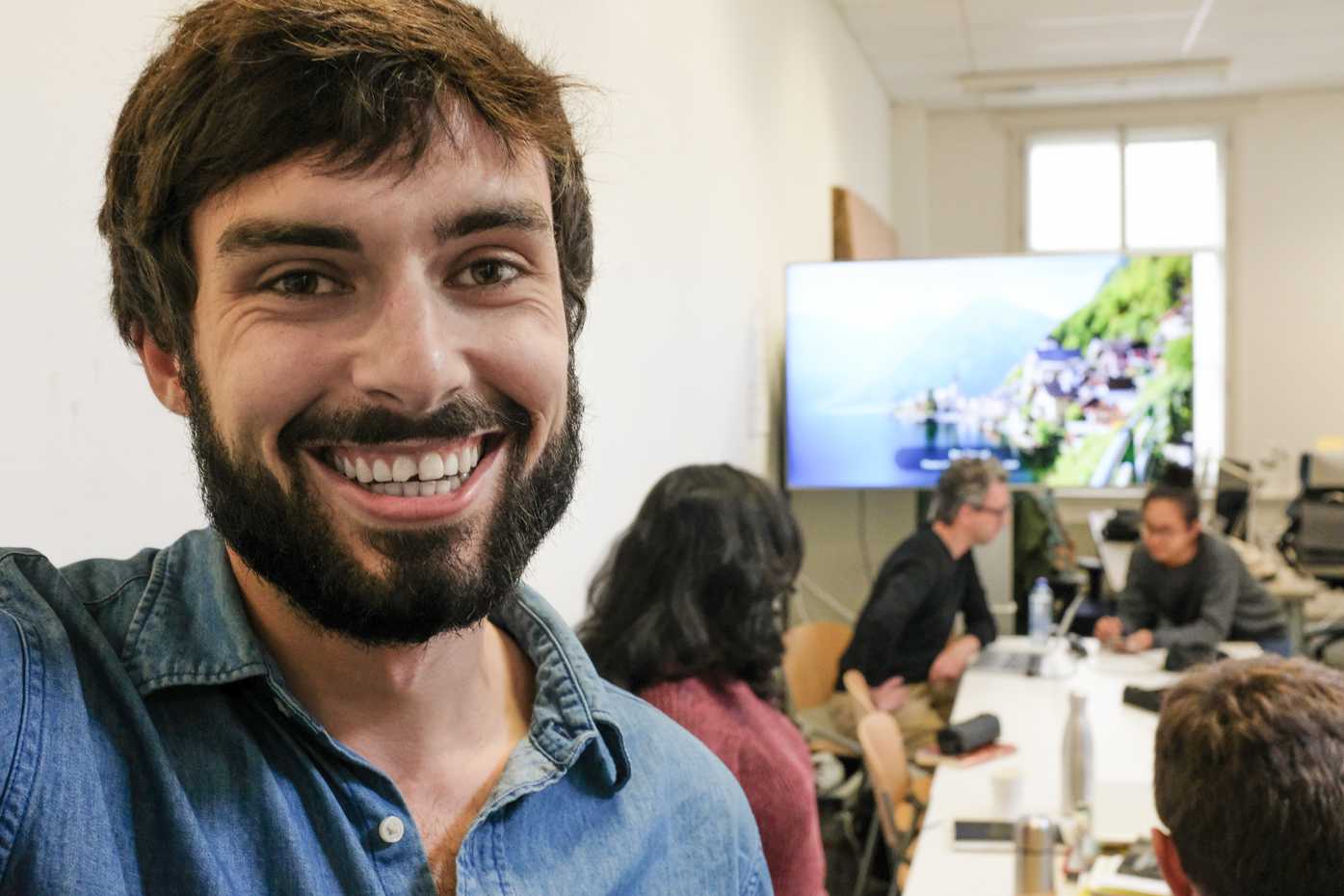
It’s healthy to have a periodic reminder to be humble, right? I snagged a rare selfie on the first day of class, with my chipped tooth, because it felt like such perfectly poor timing. 👹
TypeMedia classes, Semester 1
Our classes don’t have formal names, but each class has a specific teacher, and each teacher has a general area of focus. We have a well-rounded education this semester, and then go even deeper on an individual thesis project, next semester.
Type Revival, with Paul Van Der Laan
When: Monday mornings
Main focus of course: research and process in type revival
Primary assignment:
- Creating a typeface based on a font found in a book printed before 1940
- Producing a report on the history of the typeface and our process in reviving it
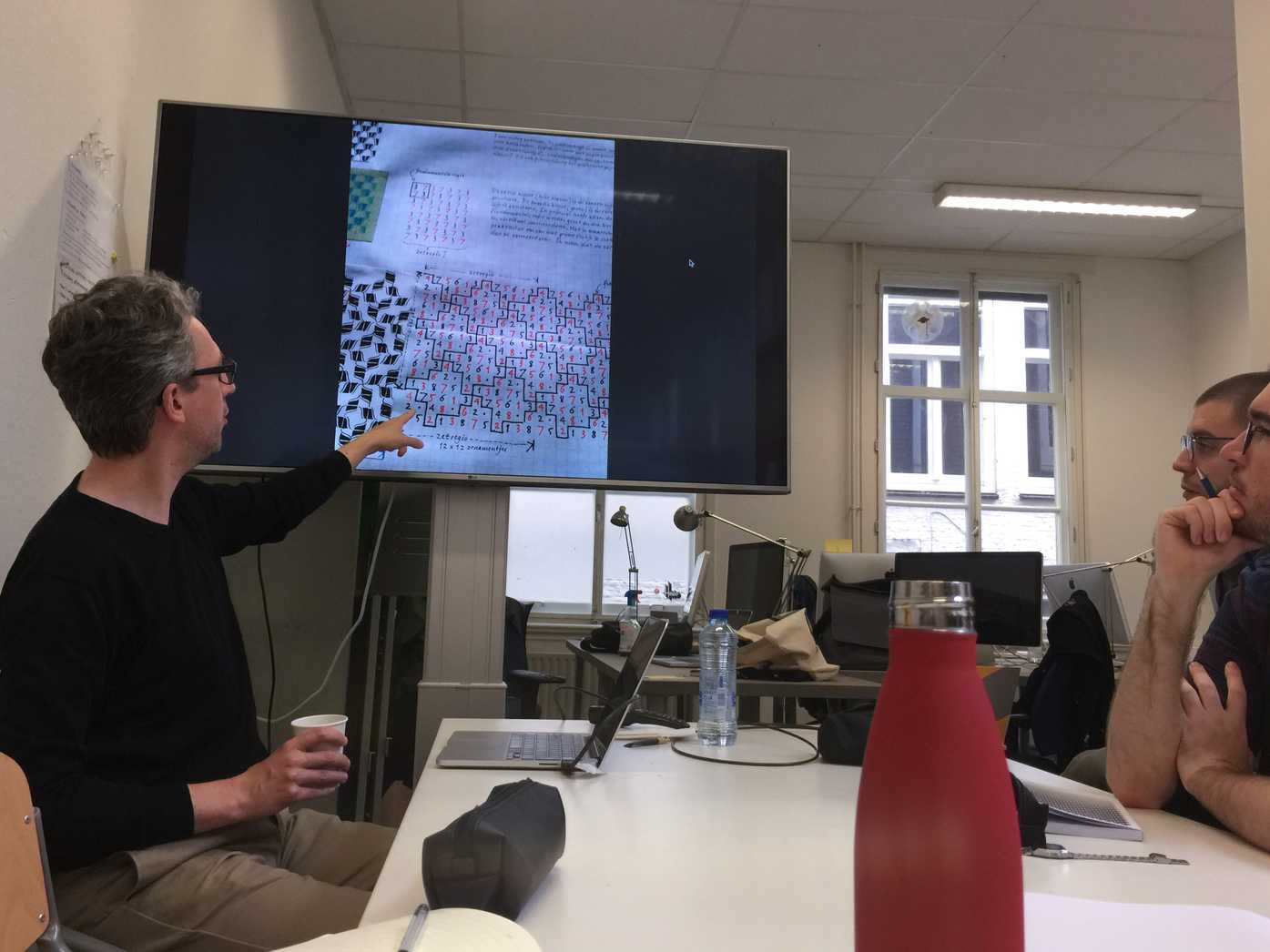
In the first session of class, Paul introduced himself. Above, he explains how he worked with Bram de Does to digitize the Kaba Ornaments.
Paul’s class is focused on type history, and he we can research and engage with history to create relevant work today. This includes discussions and materials about type history, along with the main project of type revival.
A good example of class subject matter: in the first class session, we enjoyed the incredible BBC documentary The Machine that Made Us. It’s a brilliant documentary about Gutenberg, his printing press, and how it forever changed the world. The 58-minute film is available on YouTube. If you’re interested in type, design, books, and/or technology, it’s a must-watch. Today, the printing press seems ancient, but Gutenberg wasn’t so unlike a successful modern-day entrepreneur – he had a vision, but to achieve it he had to court venture capitalists for investment, create proofs of concept to show the church how the press could be usefully monetized, and toil for years to make something that went on to change the world “overnight.” One staggering fact that shows how quickly the technology spread: just 50 years after Gutenberg printed his first bibles, Europe had 250 million printed books.
Revival project
- From now through December
- First part: finding a book printed before 1940 (so we can be confident it was printed with metal, movable type), and “reviving” that into a digital typeface
- This is about much more than just making a bunch of characters in the style of the type from the book. The bigger focus is on researching foundries, printers, and history.
- Much of the information around type history is not online, so it will force us into the libraries and archives around the Netherlands. Some of these include Museum Meermano and the Royal Archive in Den Haag, the Amsterdam University Library, and the Plantin Moretus in Antwerp. Some of us may even need to go to the Klingspor Archiv Offenback, in Germany.
“You’re in the Netherlands for a year. You’d be a fool not to delve into archives.” —Paul van der Laan
-
We had to find 1–3 books with old type. We need to own whichever book we choose to revive type from, because we will likely need to be a bit brutal with them – pushing them flat for scanning, and maybe even cutting out pages for closer analysis.
-
We need to select a reading typeface, not something specific to captions or headlines. It should have a good character set, as well, so that we don’t have to make up very many new characters to have a complete font.
-
We will be expected to remake at least the upper and lower case, numerals, and punctuation. However, this is not about who can make the biggest character set. It’s about research, having doubts, asking questions, and exploring our approach.
-
Good questions to ask in our research are:
- Who printed it?
- Who founded it?
- Are there original drawings?
- What is the nationality/pedigree?
- Did they base the design on something earlier? Were there similar contemporary designs?
- What recreations and adaptations have been made, since?
We will need to write an essay to document:
- Our historical research on the background of the type
- Our complete process of digitization
We will also need to create a printed specimen of our type.
Primary goal: in addition to exploring how to make a good type revival, we should be establishing an archiving and research process. Paul uses Evernote, but we can explore other methods.
We will be evaluated on the content & execution of our essay and type specimen.
Stonecarving, with François Berserik
When: Tuesday afternoons, starting in late October
Main focus of course: carving letters in stone
Primary assignment:
We will be carving words in stone in order to better understand how tools influence the shape of letters.
François is pretty awesome, and I’m excited to learn from her. One funny and cool thing she told us when meeting our class for the first time: she refuses to use email, and corresponds with our course administrator only in person and via physical mail. #lifegoals
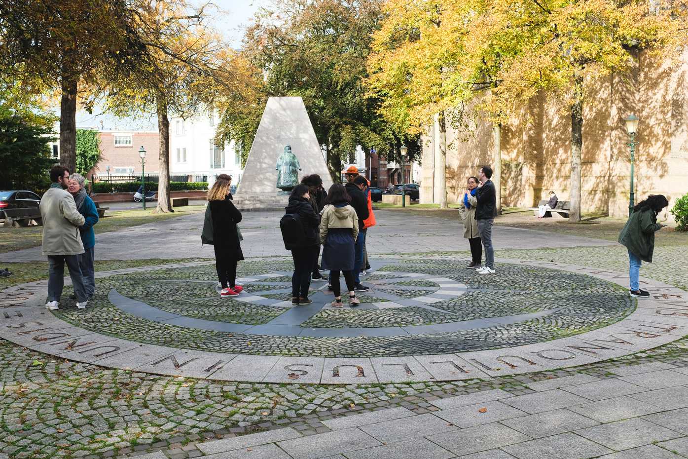
Class won’t properly start for another couple of weeks, but we had an introductory session that was a “type walk,” where François showed us some of her favorite instances of lettering in public spaces in Den Haag.
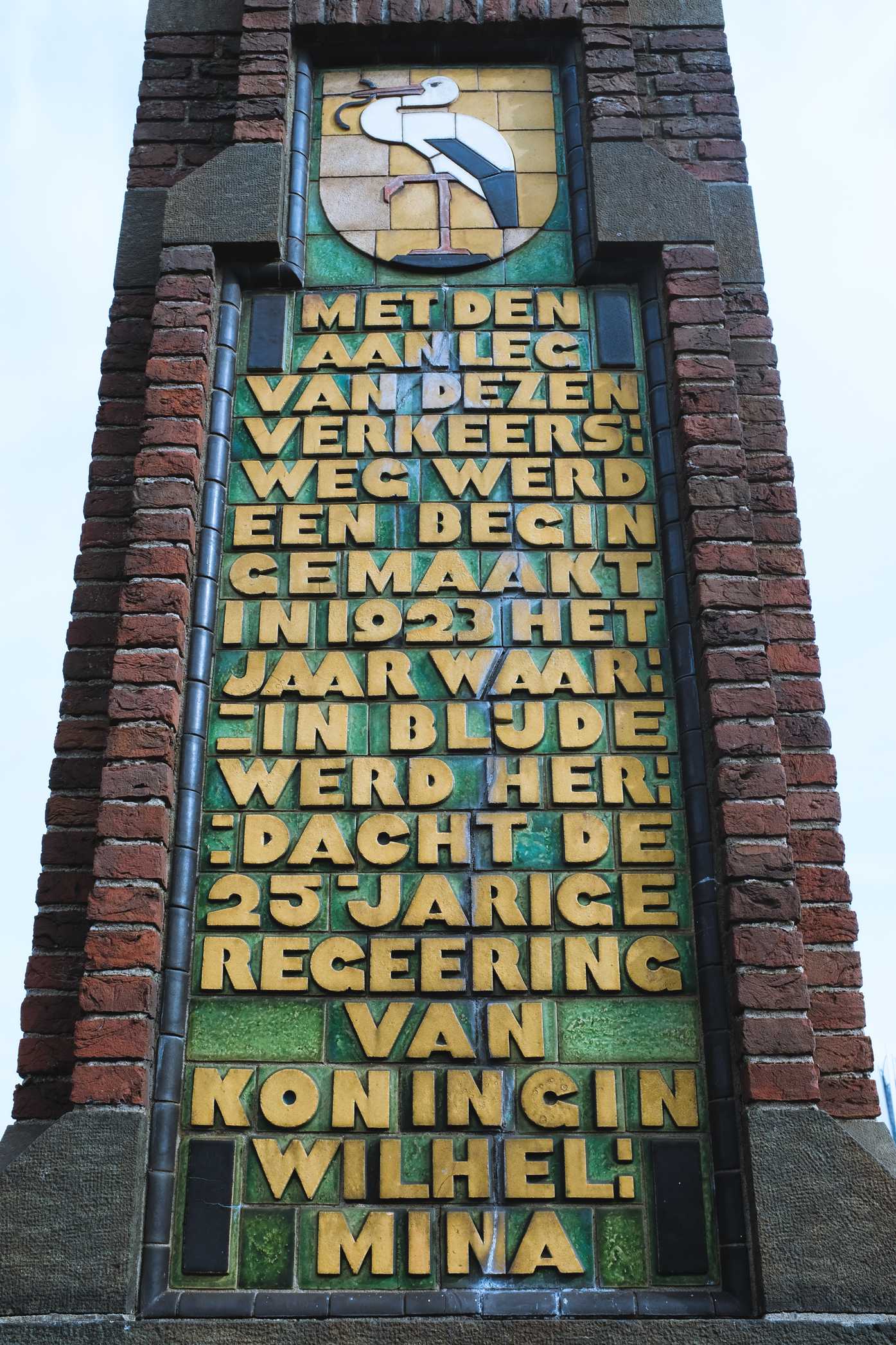
One of the class favorites on the type walk was the above monument for the 25th anniversary of the throne of Queen Wilhelmina, designed by Hendrik Petrus Berlage, who is apparently Holland’s first Modernist architect.
François filled us in on why the symbol of Den Haag is a stork with a black eel in its beak: historically, there was a fish market in Den Haag, where storks would prowl the aisles to pick up scraps of fish—eels included. Fun fact: storks can be between 2.5 to 5 feet (75–152 cm) tall, so I imagine this would have been a fairly intimidating sight at the fish market.
[Undefined], with Petr van Blokland
When: Tuesday evenings, in Delft, starting in late October, but with remote assignments before then
Main focus of course and primary assignment: To be determined
Class hasn’t totally started with Petr van Blokland, though we have had a few assignments so far which give some indication of what class will be like. The first assignment was to create a 1-page proposal for a 10-session course topic and structure, the second assignment was to describe the process of the first assignment, and the third assignment was to read our classmates’s proposals, and propose a method for ranking them and choosing a class topic.
Based on the proposals, the course will be about design process, testing, generative design, or variable font technology. Based on the first three assignenments, I’m also predicting a few curveballs from Petr. 😸
Python and Drawbot, with Just van Rossum
When: Wednesday mornings
Main focus of course: introducing us to programming as a way to enhance and broaden our type design process
Primary assignment: creating an alphabet in Drawbot (though we are encouraged to also explore as deep as possible, with particular emphasis on creating tools to use in type design software such as Robofont)
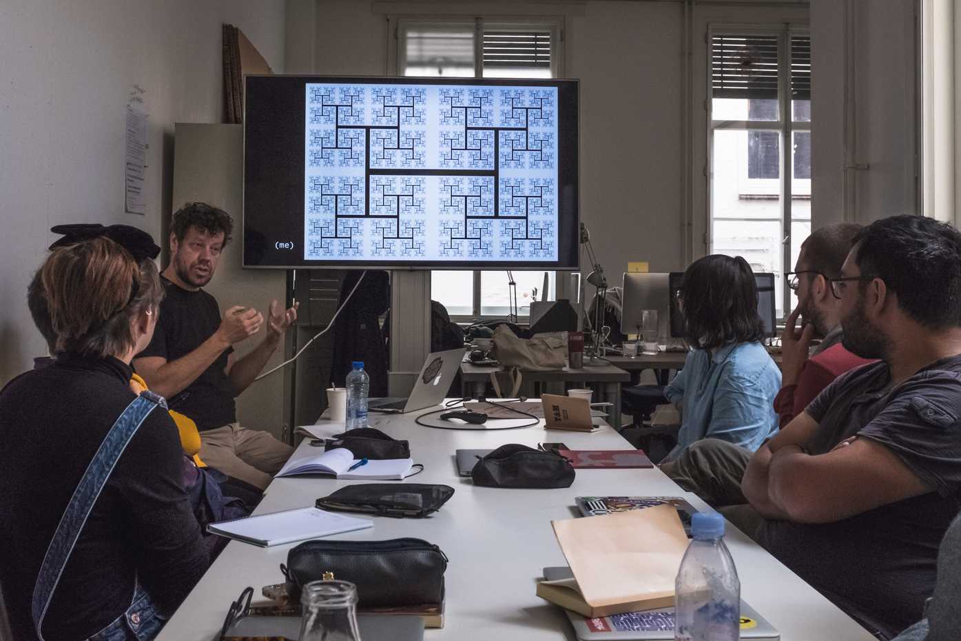
Each of our teachers is amazing, kind, thoughtful, and thought-provoking in their own way, but so far, I find myself a little biased towards Just. Partly, it might just because of my fascination with code and computers, how much I admire his approach to this, and how much I hope to and enjoy slowing progressing in this area of design process.
That’s what I love [about experimental design with scripting]. There are no mistakes, only happy little accidents. Keep track of your mistakes. —Just van Rossum
Two awesome things Just has made recently:
- His wonderful work bringing to life the visual identity of the Lowlands Festival
- His tumblr of drawbot experiments, Daily Drawbot
Something I didn’t know until our first session of class: Just’s older brother, Guido van Rossum, is the inventor of Python. Just is a pretty incredible teacher to have, because he’s been in the middle of digital type engineering for the past few decades, and he obviously understands more than a few things about Python.
As part of this class, I’ve gotten to know a few of the basics of Python in the past few weeks, and it’s fun! As a coding n00b, Python feels like Javascript in many ways, if somebody cleaned out the syntax. I have quite a ways to go, but I’m really excited to dig deeper.
I’ll be putting together a post about Drawbot for beginners soon, and I’ll try to include a few fun experiments I’ve done. Until then, feel free to check out my code and exported gifs on my GitHub drawbot repo.
Calligraphy & Type, with Peter Verheul
When: Wednesday afternoons
Main focus of course: how type is influenced by writing and calligraphy
Primary assignment: creating a type family based on flat-brush calligraphy which will include 4 fonts:
- A primary font in book weight, optimized for long-form reading
- A high-contrast variation (with a large amount of thick/thin contrast, basically a super-bold display face)
- A low-contrast (basically, a sans-serif or slab-serif)
- An informal (display) version of the primary font, made for short, attention-grabbing texts like book covers or posters

One of the first things mentioned by Peter was the influencial book The Stroke, by Gerrit Nordzij. Nordzij was a professor of type design at KABK, and the current Type]Media program really came from his students, which include most of my teachers today. If you look at the type projects of T]M graduates, you can start to see how this tradition of type-from-calligraphy has made its impact on the program.
The central ideas of The Stroke are:
- Every letter is formed by a tool, and that informs its shape
- There are two main styles of letter: translation (from flat writing instruments) and expansion (from the pointed pen)
- Letters can be running (connected cursive script) or interupted (most type, including what you are reading now)
- It is possible to interpolate type between different axes of weight, contrast, and width—this idea leads to Nordzij’s concept of “The Cube,” and has given a theory to how large families of type are created today.
Our final presentation will be based on one of these extremes. Even though we will be doing a fair amount of calligraphy and ink-on-paper letter drawing, this class is about type design. These exercises are about seeing, more than about becoming experts in calligraphy.
As a sample of the course, here was what we covered in the first class:
- proper brush & watercolor techniques for calligraphy
- practicing making long, straight lines, both vertical and horizontal, with a brush held at 30°
- practicing writing n’s and o’s
- construction of a roman, lowercase, translation alphabet
- analysis of how an alphabet is often made up of only a few distinct components. There’s the shoulder (a, n, m, h), the upright (b, d, i, j, l,), the bowl (b, c, d, g, o, p, q), angled strokes (w, x, y, z), and sometimes, the serif.
“Try to like what you are doing. Actually, forget about the word try. Like what you’re doing, and it will show.” —Peter Verheul
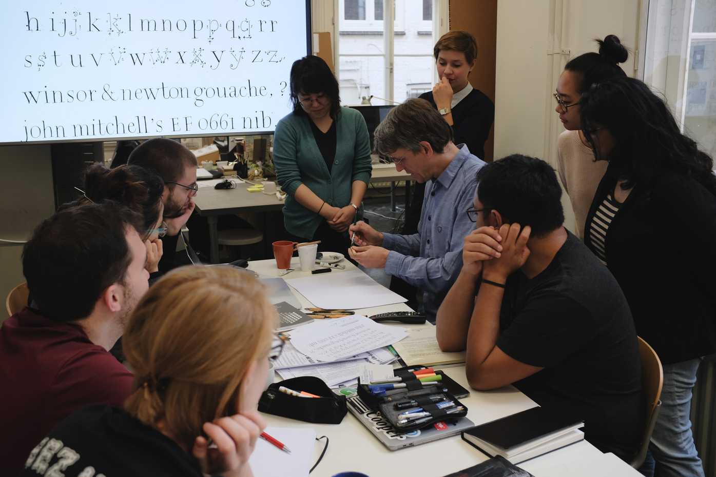
Investigations in Type Design, with Erik van Blokland
When: Thursday mornings
Main focus of course: This course will be the most varied, and is the only course that will happen in each semester. At the start, we will be working with pointed-pen calligraphy, but it seems like this course will be a wide-ranging series of lessons from Erik on type history, pointed-pen calligraphy, font editing, scripting, spacing, and personal practice.
In the first session of class, we looked at how to construct letters with a pointed pen, including the smart technique of writing with guache, and using a paintbrush to hold extra guache and constantly reapply this to the pointed pen nib (in contrast to my familiar method of dipping the pen into ink, which tends to be messier, and to be more of an interuption of workflow).
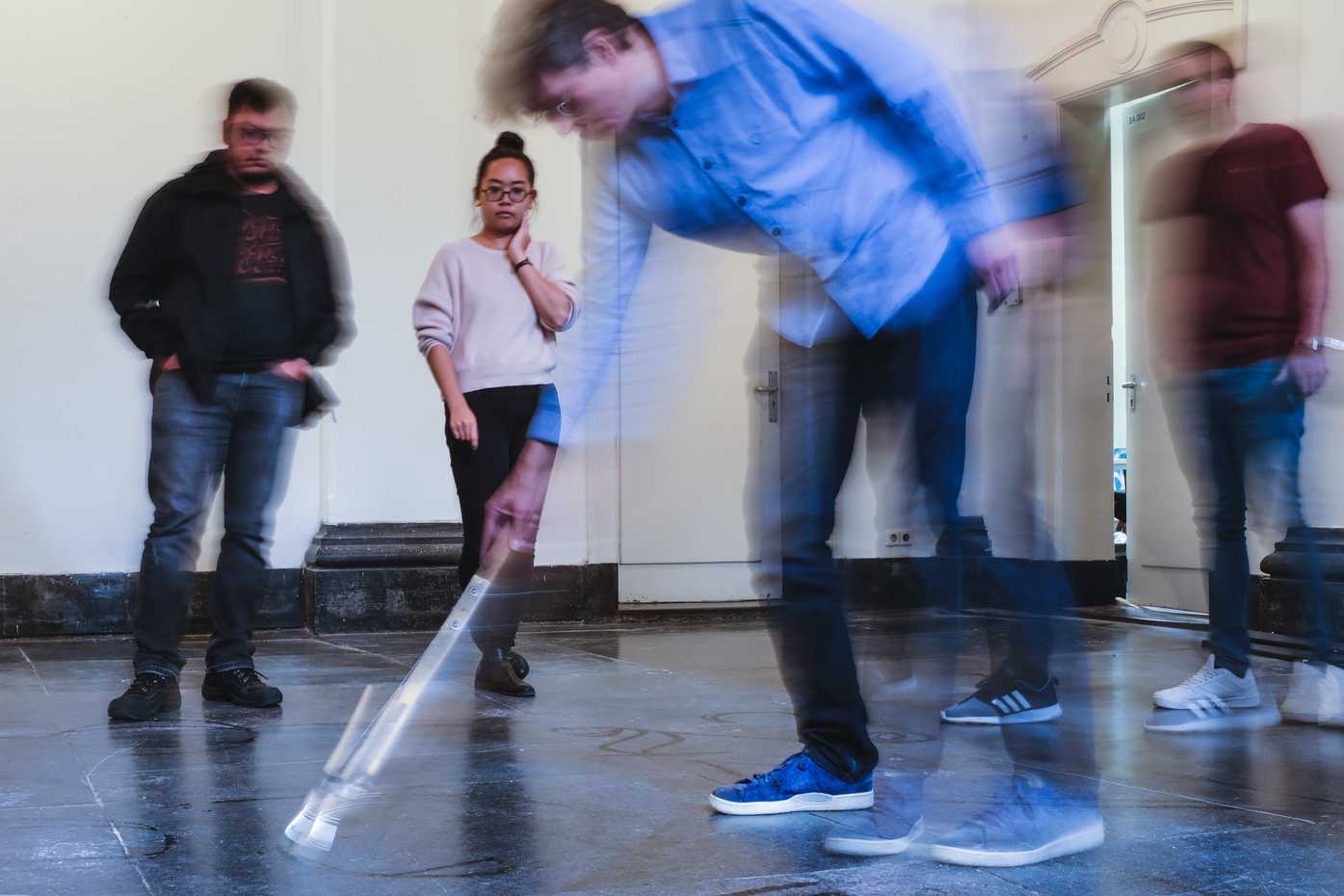
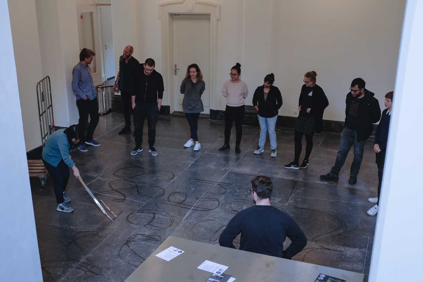
Erik also brought a tool that is an extremely large pointed pen, called the “whopperplate pen” by its American inventor, due to it being a very large pen for drawing “copperplate” style letters. We had fun as a class, drawing with this pen and water on the stone floor outside our classroom.
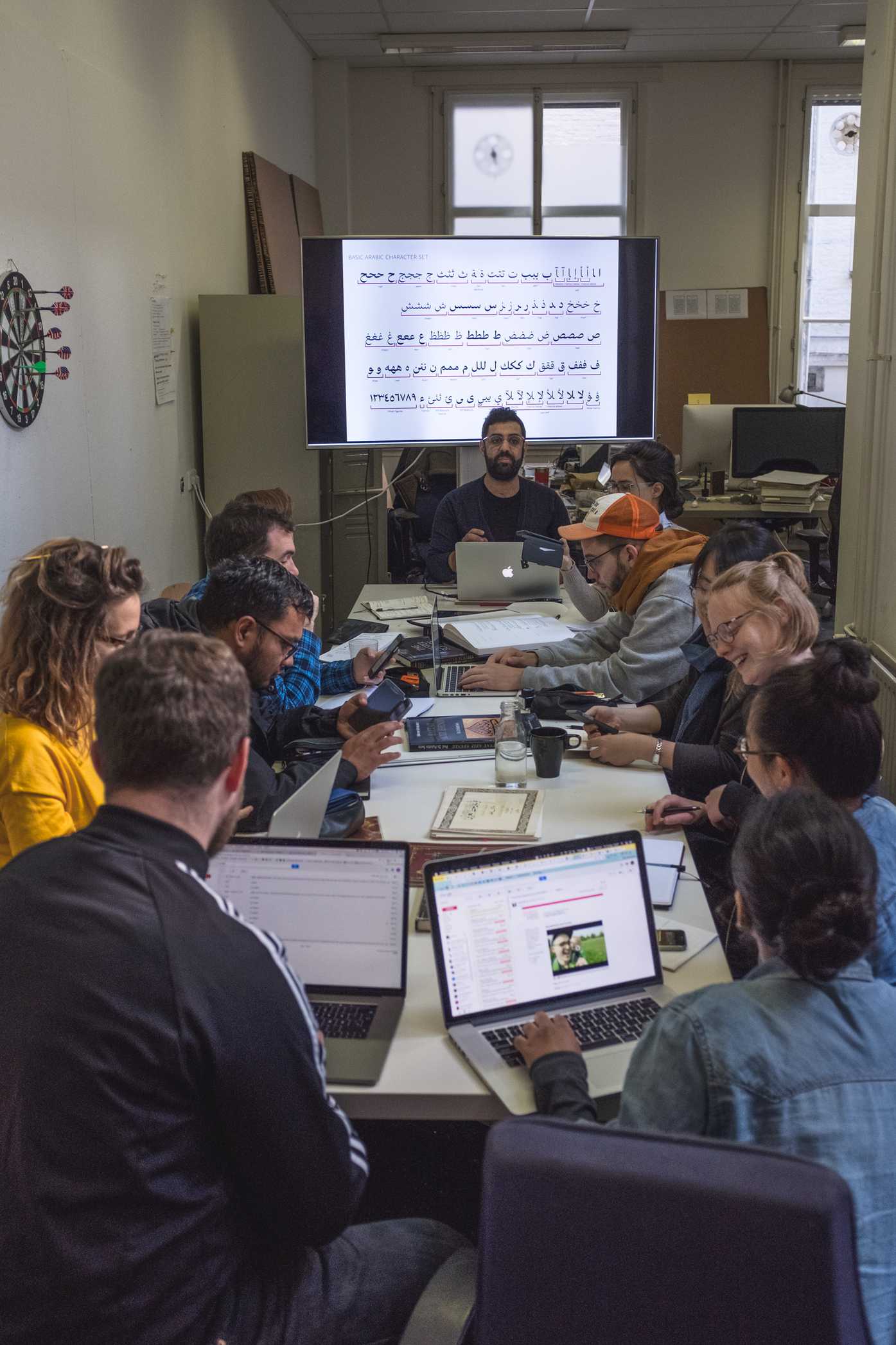
Arabic Type Design, with Kristyan Sarkis
When: Friday afternoons
Main focus of course: studying how Arabic languages are written, including the history of Arabic calligraphy and type design
Primary assignment: developing an Arabic script based on research and understanding of Arabic writing and calligraphy
Kristyan Sarkis is a type designer who was originally born in Beirut, and now lives in Amsterdam. He did Type]Media in 2010, and he has since started TPTQ Arabic, a type foundry which produces high-quality Arabic fonts. He’s an amazing teacher, and it’s fantastic to be learning such a totally-new-to-me script from someone who is so thoughtful, patient, and driven to raise the quality of type in the world.
Before this class, I had no idea of what the Arabic alphabet was, and knew next-to-nothing about how the Arabic language works. I still know very little, but the little bits I’ve picked up have been fascinating and beautiful.
One app I’ve found super useful and informative for learning about Arabic is Arabic Quick!, which has accessible, well-made documentation and simple quizzes on the forms and sounds of the Arabic alphabet.
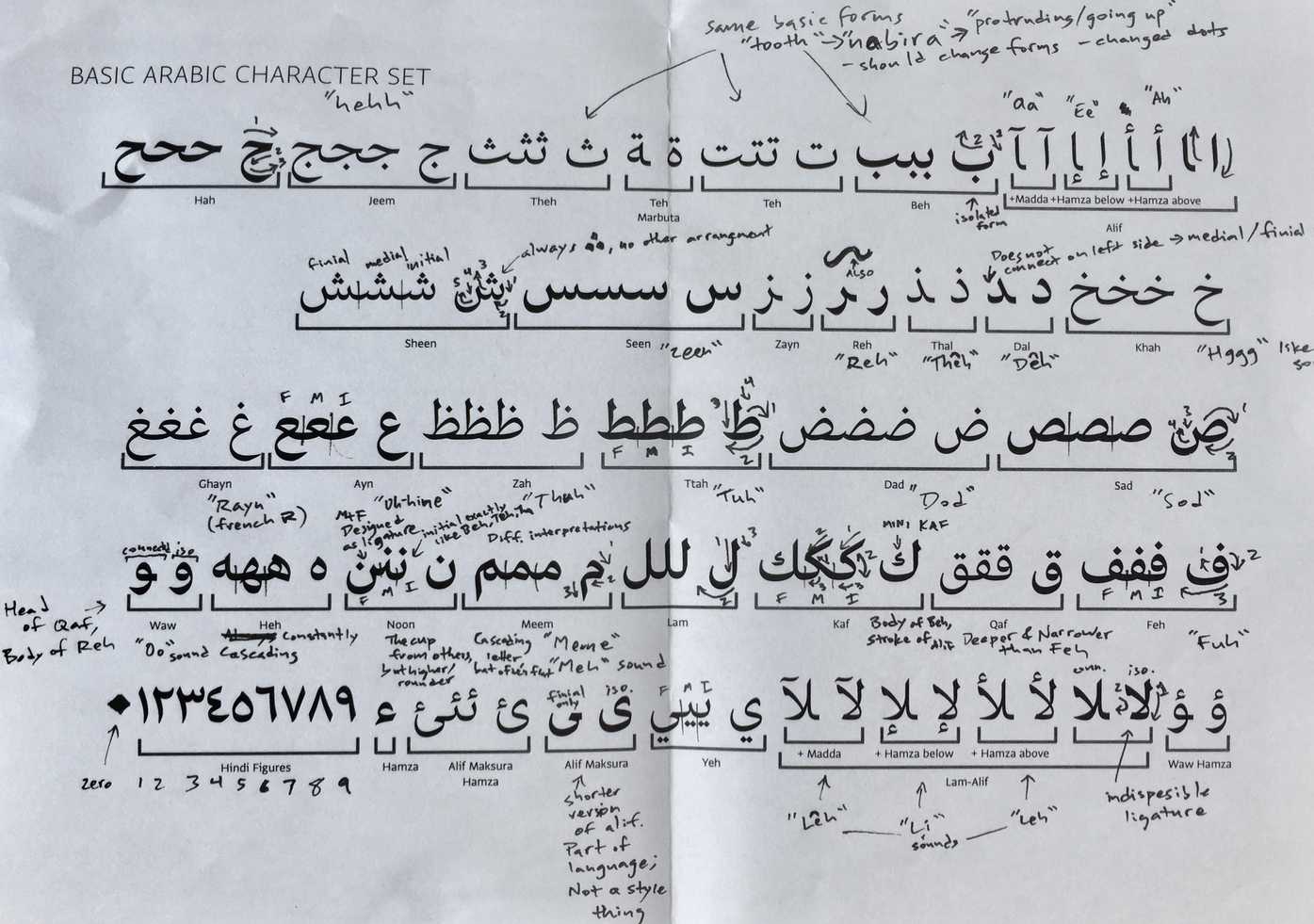
After practicing drawing Arabic type from samples in calligraphy books and from what we’ve learned from Kristyan, we are just starting to draw Arabic alphabets based on our own concepts. One thing I wanted to make (and hopefully still might make, some day) is a monospace or mostly-monospaced font inspired by Nastaliq letterforms (a form of Arabic calligraphy from Iran, and the predominant form in countries like Afganistan and Pakistan). However, for the time we have in this course, I will be working on a Arabic companion typeface for Cooper Black / Cooper Old Style, with the idea of making something useful for display purposes like restaurant menus, album art, and posters.
Cooper Black is actually an excellent source of inspiration for an Arabic script typeface: the original has a form that is distinctive due to its ultra-bold weight and forms that have only curves with no sharp angles, but it is also an “old style” typeface, with contrast that reflects letterforms created by a flat writing instrument. The main focuses of our Arabic Type class are 1) learning the right places to include thick and thin points in Arabic letters, based on the traditional forms, and 2) making letters that reflect classical letter proportions. Extending an “old style” Latin typeface allows me to do both these things, while still making a font in the spirit of the original. I’m excited to be making the basic character set in the coming couple of weeks!
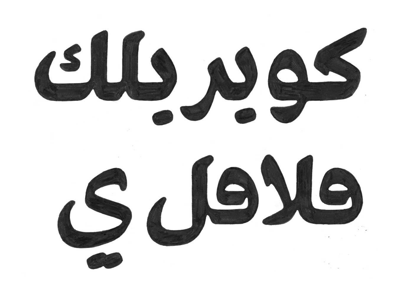
Above: Cooper Black Arabic. This is bad spelling and poor drawing, but hopefully it shows how fun a project this will be. More to come from this, soon!
The course is full time, and most of us spend full days at school, as much as the building’s open hours will allow. I don’t have photos to show for most of the highlights, because the best part is getting to learn with and from my classmates.
One thing that I did grab a few photos of is a somewhat magical thing that design schools are thankfully helping keep alive: letterpress printing.
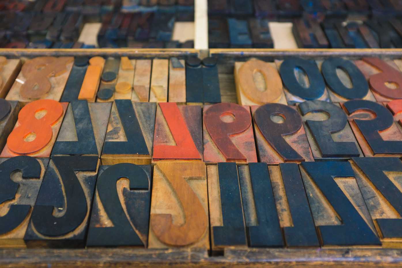
Wood type in the KABK collection.
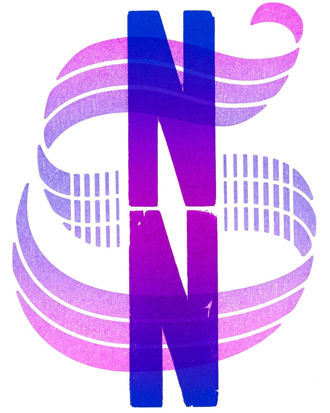
In TypeMedia tradition, our class is making a set of small booklets with our monograms, printed one-per-page, and our contact details set in lead type on the final pages. In the first session, we set one of our initials in wood type, and in the next session, we will be overlaying the other initial with a letter we design and cut ourselves (via linocut, lasercut, or other methods). I cheated on the first round, and stacked two condensed Ns to create one very-compressed N.
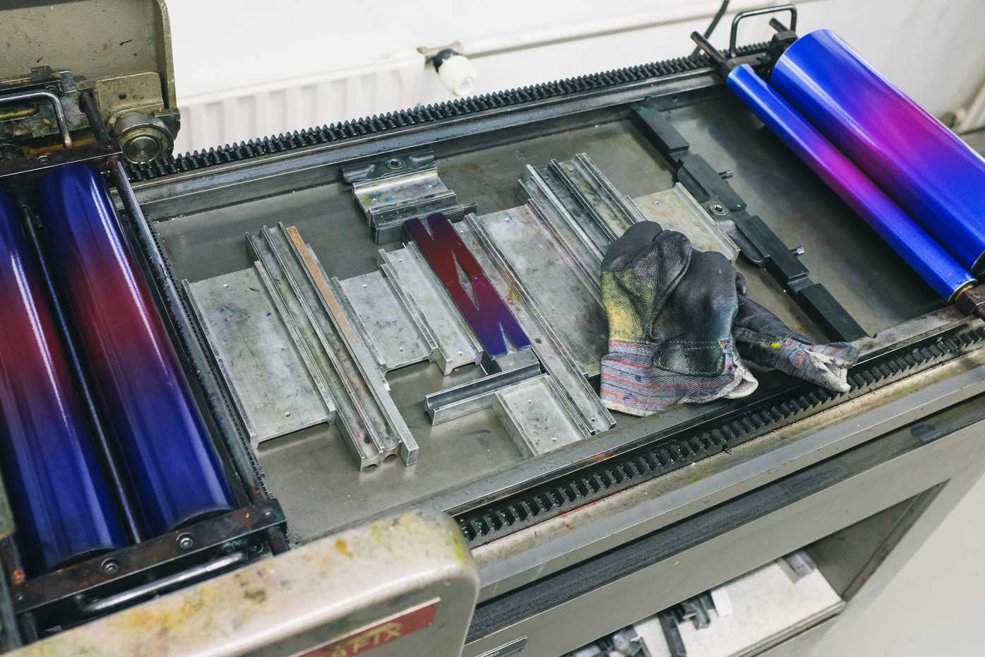
Two narrow N’s set on a printing press.
For the second round, I made drew vectors of a blackletter S in Glyphs, chopped it up a bit in Illustrator, then lasercut it from wood and printed it. It’s letterpress, so things that might otherwise be centered are off-center, but I’m quite happy with the overall result. It was fun to make, and I can’t wait to have a booklet of the awesome initial prints from my classmates!
We are also settling into the classroom, and creating our workspaces. I should have brought a US keyboard along with me, but aside from the current lack of an external keyboard, I am pretty stoked on my setup.
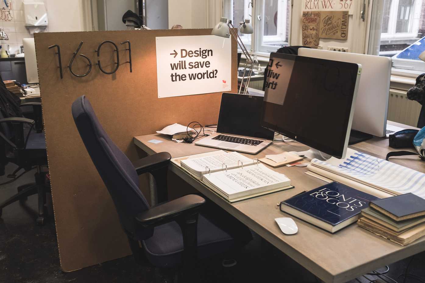
My desk in the TypeMedia classroom.
Bonus: I found a great dentist who was able to repair my tooth after the first week of class. I was a bit nervous about seeing a dentist in a new country, but the experience at this particular was easy and painless.
Things are off to a very packed, but very exciting start!