September 07, 2017
TypeMedia class introductions + hot tips™ to giving a good self-intro presentation
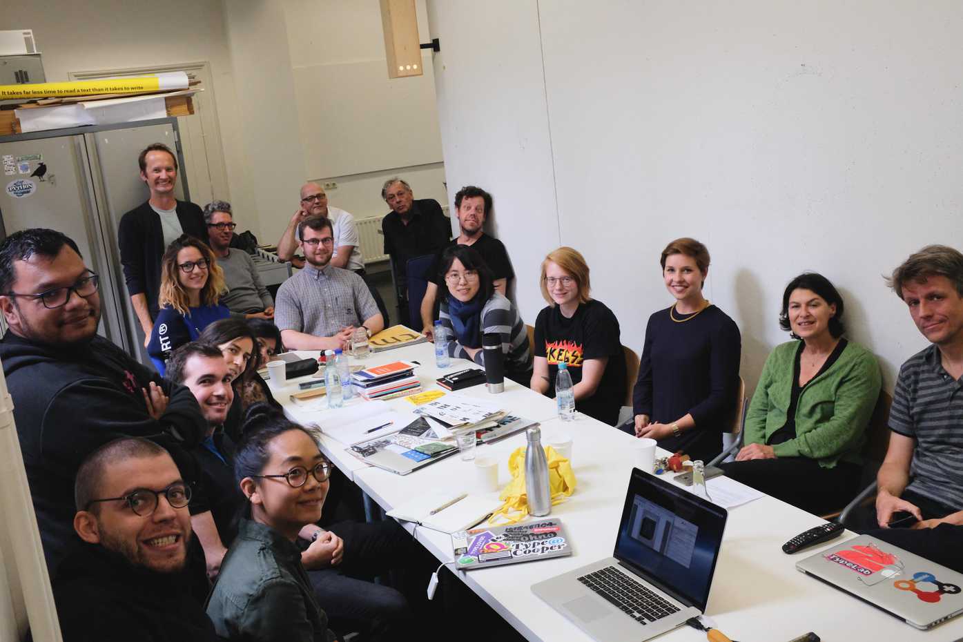
Today, September 7th, we met (most of) our teachers and had a walk through the calendar for the year and of the course expectations. Then, each student presented for 10 minutes to explain who they are, where they come from, what work they have done, and what they are most excited about.

I loved learning about the hometowns, families, portfolios, and hopes of my classmates! The presentations left me feeling so lucky and excited that I’ll be able to learn amongst this group for the next 10 months.
To be honest … I also ended with the feeling that I didn’t give my best presentation. In large part, this is because I have spend the past few days working on this blog, both in organizing photos and massaging the layout and code, plus an experiment in the metal workshop – and procrastinated on my presentation, leaning more on already-made portfolio material, rather than remaking something for this. In part, I’m glad that I focused on these things in the past few days and it was still fun to present. However, I finished with the feeling that I didn’t give a very good impression of who I am, and I literally forgot to show several things I had prepared. 😬
Just in case anyone is reading this who will be a future TypeMedia student, I’ll mention a few things I wish I had done in my presentation, plus the format of the most interesting presentations. Yes, some of this seems like basic stuff, but it’s some of the basics that I missed!
The best presentations included:
- Their name or nickname, and how to pronounce it
- City and country of origin, with a map
- A quick description of that hometown (e.g. Carlos’s hometown of Logroño, Spain, is not near the beach and is not full of flamenco dancing, but is near mountains and desert, and does have lots of beautiful, old, hand-painted signs)
- A photo or two of their family, sometimes when they were a lot younger, and a description of who they are
- Personal interests outside of design
- Motivation / what got them into design (e.g. Gen’s dad was a signpainter, so as a child and teenager used to study the Speedball Textbook of lettering)
- Where they went to school, and where they’ve worked since – not just a scattering of favorite projects, but also why they were interesting (e.g. Lisa has been 1 of a team of 21 at the Black Foundry, working on a typeface with Asian language support)
- Communities or design initiatives they’ve helped organize outside of their main work
- What they hope to learn in the course
A few of things I should have done:
-
I should have used Keynote. I built my “about me” presentation with InDesign, so I could use existing text styles and layout that would match the portfolio PDFs I showed subsequently. This was relatively fast, but I sacrificed:
- The ability to use GIFs (obviously a critical loss)
- The nicer presentation mode of Keynote, which includes the time on the second screen
- I should have put on my own iPhone timer and placed it next to my laptop. Better still, I could have brought an iPad, which has a very clear timer UI, so that everyone could have benefited. A teacher did time each presentation but this timer was visible by him more than by us. I rushed my presentation and ended before showing several of the things I wanted to. I think I may have stopped presenting with something like 2+ minutes to spare – time in which I could have shown more recent projects, in the browser tabs I had already pulled up but minimized.
- I should have practiced. This is embarrassingly simple, but somehow it’s easy for me to forget. I thought I had gotten used to giving presentations in my three years at IBM, but … I think I had mostly gotten used to presentations delivered remotely, over video chat. I underestimated how excited I would get in front of a live crowd, and how my internal sense of time would get all messed up.
I’m already looking forward to the next class presentation I get to give so I can put these lessons into use!
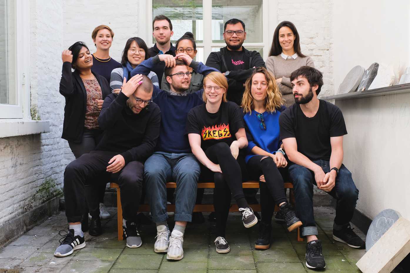
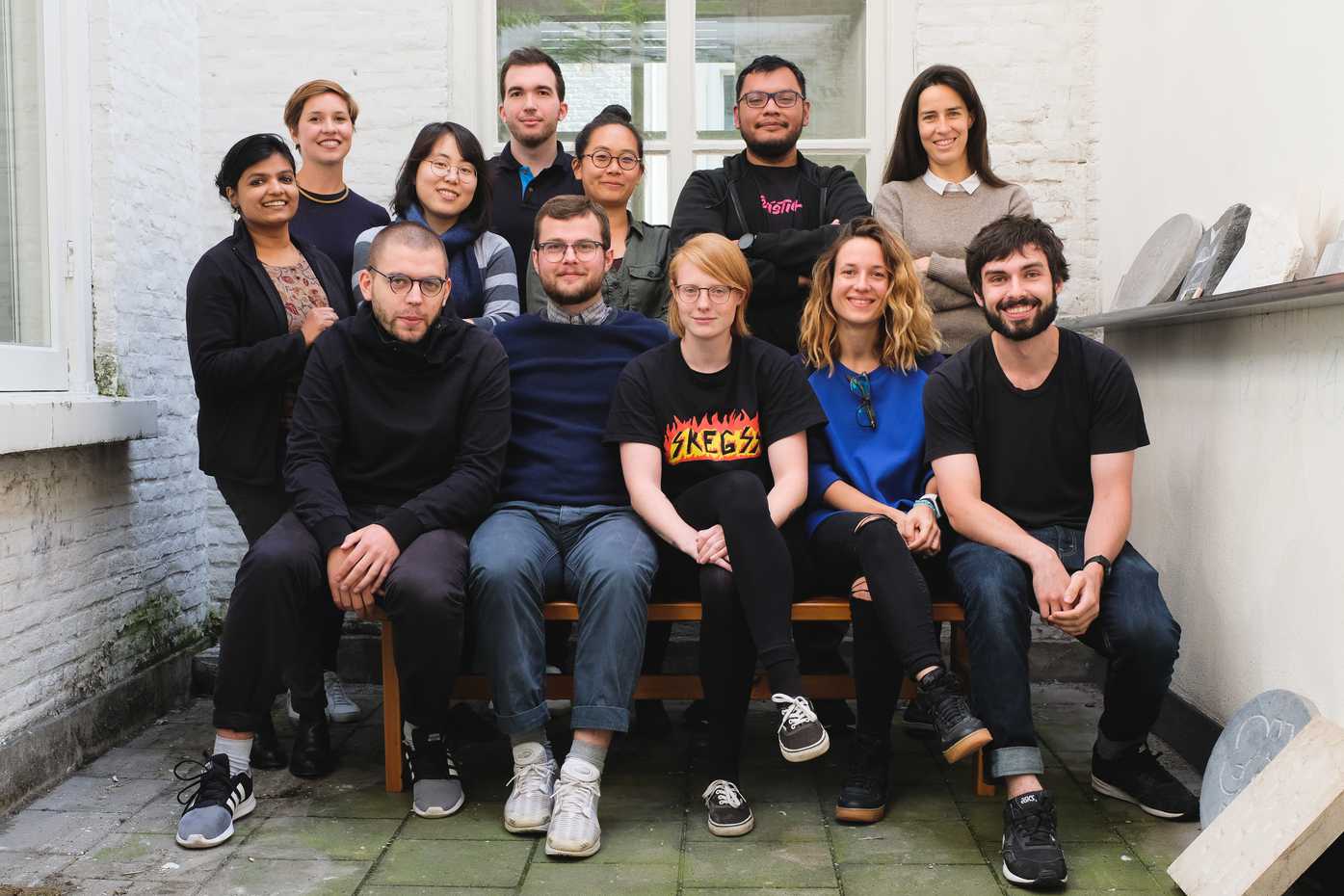
Despite all this self-critique, I really had an awesome afternoon, and it was terrific to learn about my classmates. Best of all, I even managed to convince everyone to pose for a new class photo, and coerced Peter Biľak into taking it for us. I wanted the retake so we could balance out a bit more (the first photo had everyone lumped to the left) and yes, so I could fix my hair. Hilariously, my class organized themselves almost identically to the first shot, unbalanced and all. Peter Biľak also managed to get a good photo where several of my class were prepping their hair – including Rafał, whose hair is about a millimeter long.

Prepping for the shot…

🎉 The retake! Thanks, Peter. 🎉
Above, top row, from left: Namrata Goyal, Mona Franz, Noheul Lee, Carlos de Toro, Lisa Huang, Gen Ramírez, Claudia Rifaterra.
Above, bottom row, from left: Rafał Buchner, Seán Donohoe, Katja Schimmel, Zrinka Buljubasic, and me